Dacha Media
OPENING DOORS TO THE WORLD: New logo, visual identity and web for a journalistic and editorial services firm
Client
Dacha Media
Industry
Editorial & Translation Services
Services
Brand Strategy, Brand Identity Development
Year Completed
2015
Project Photography
Startling Brands
DACHA MEDIA provides consulting, journalistic and editorial services for international clients seeking to maximize their exposure to English speakers. The company was founded in 2015 in Berlin by journalists with years of experience working with leading international and German news outlets including Der Spiegel and Die Zeit. As a brand-new company, Dacha Media approached us with the task of developing a new visual identity system, marketing materials and a website.
RESPONDING TO CURRENT TRENDS
Tailoring the professional journalism translation brand
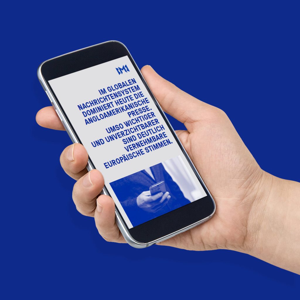
The biggest responsibility when working with newly created companies is finding an appropriate brand image that clearly communicates the company’s focus, values and vision. DACHA MEDIA operates in the field of professional journalism – offering editing, content and translations for diverse media organizations. As such, our goal was to build an identity system that strategically emphasizes the company’s direct link to the media business and communicates the agency’s great deal of experience interpreting and responding to current trends in publishing, while at the same time maintaining the image of a trustworthy consultancy run by veteran industry professionals.

Striking both in physical and digital applications
Typographic identity celebrates the heydays of newspaper publishing
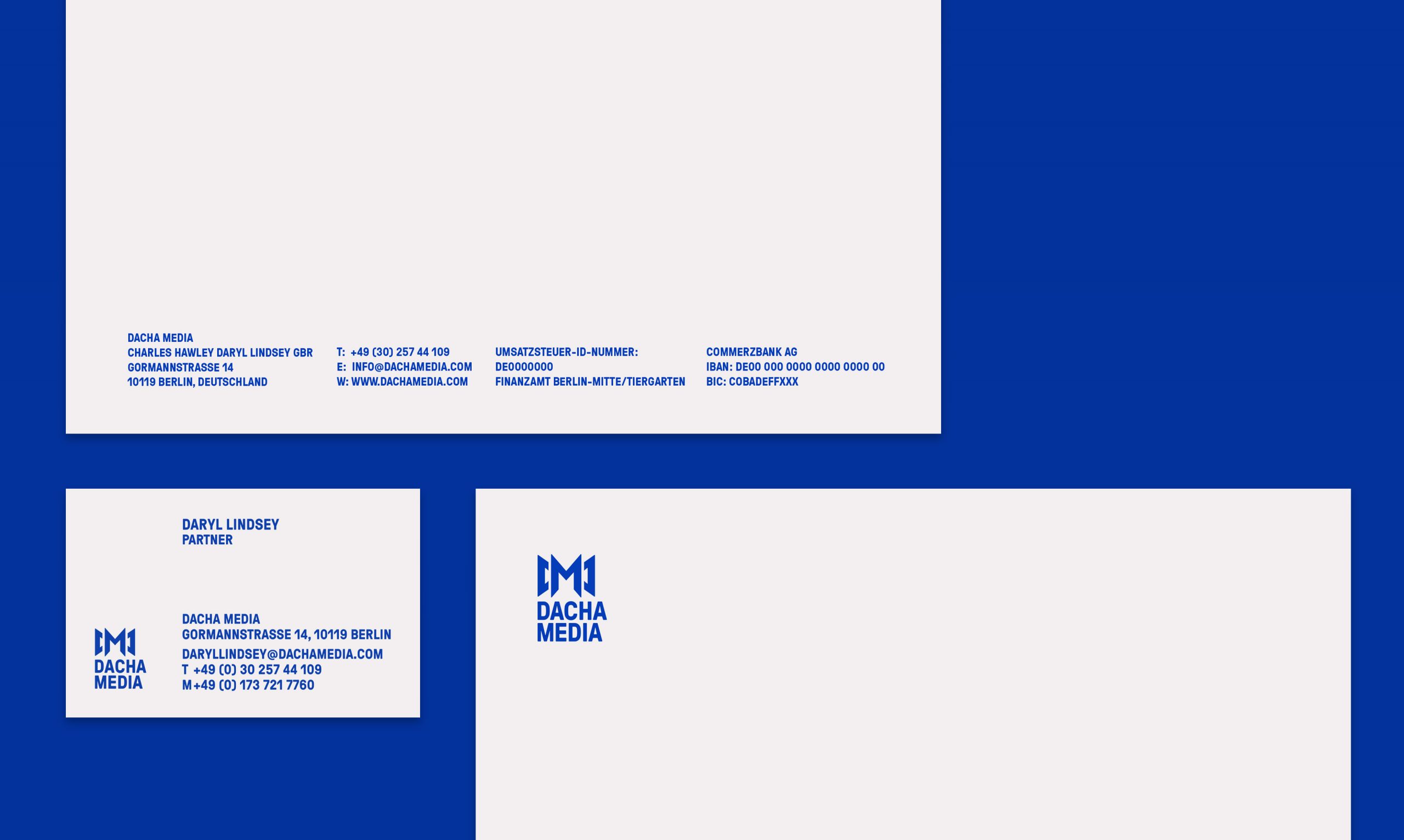
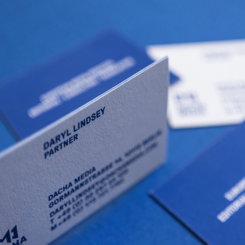
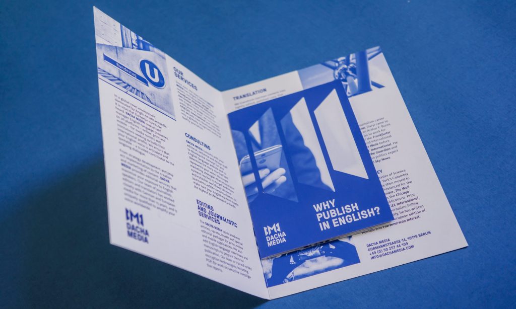
The creative approach to DACHA MEDIA’s identity system is primarily based on the typography used in bold newspaper headlines. The company’s media focus is also the inspiration for its logo, which features the letters “D” and “M,” which have been tilted in order to create the resemblance of an open publication. The idea was then further developed across both print and digital applications. In brochures, we used two different paper formats to create a depth of the physical object itself, while for the digital applications we developed a custom script that splits and tilts any image to evoke that feeling of depth and the sense of opening a publication. Although the overall look of DACHA MEDIA’s visual identity plays slightly on the retro vibe of the heyday of newspaper publishing, it also uses a simple color palette, imagery and strong typography in order to achieve a bold contemporary look that provides brand authenticity in the era of digital publishing.